Empresa:
Elinksys
_____________________________
Serviço:
Branding
_____________________________
País:
Brasil
_____________________________
O Projeto
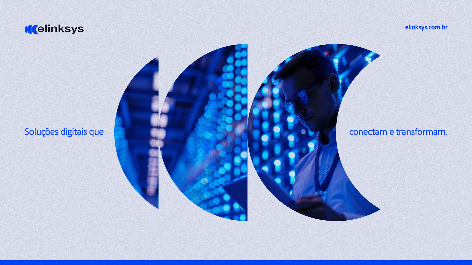
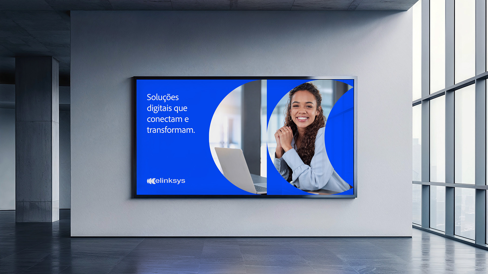
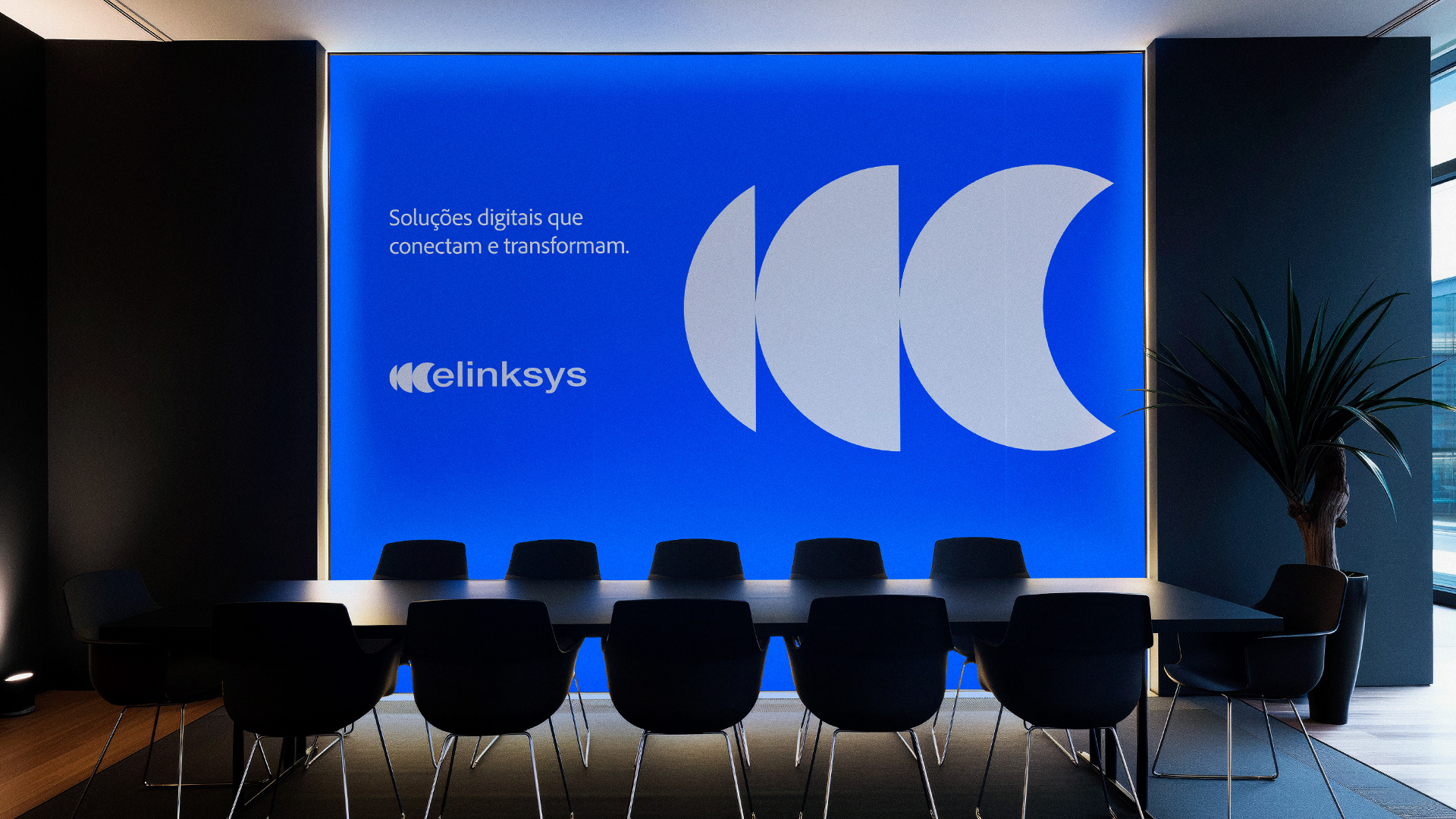
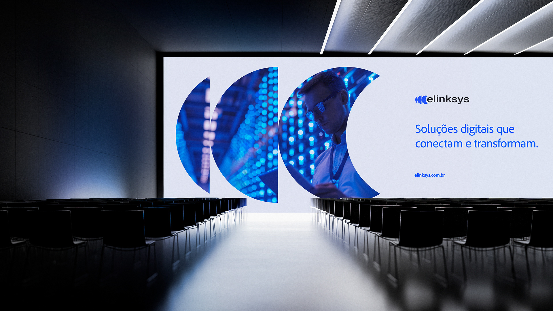
Elinksys — Soluções digitais que conectam e transformam.
A Elinksys nasceu para fortalecer as conexões entre pessoas, dispositivos e sistemas, oferecendo soluções digitais inovadoras para um mundo cada vez mais conectado. O projeto de identidade visual foi construído com base em três pilares fundamentais: fluidez, inovação e confiabilidade.
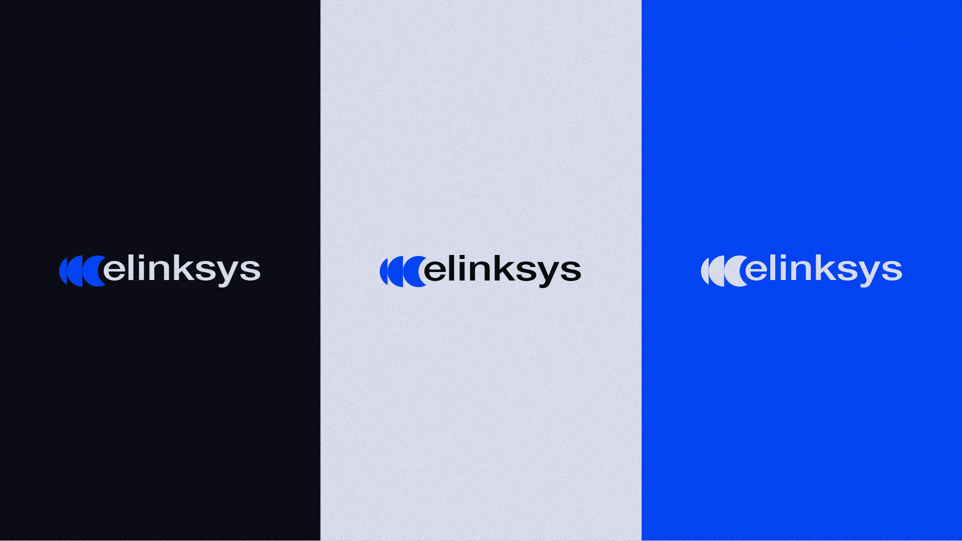
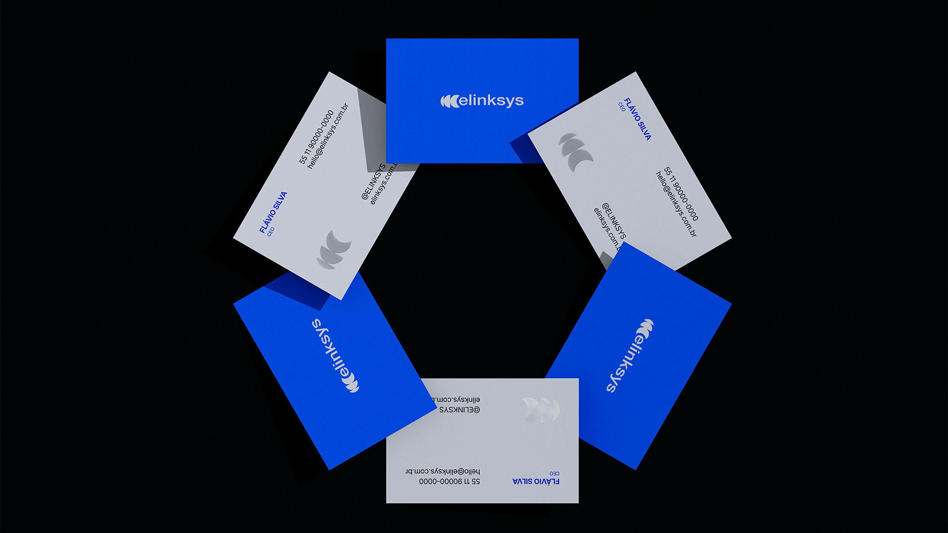
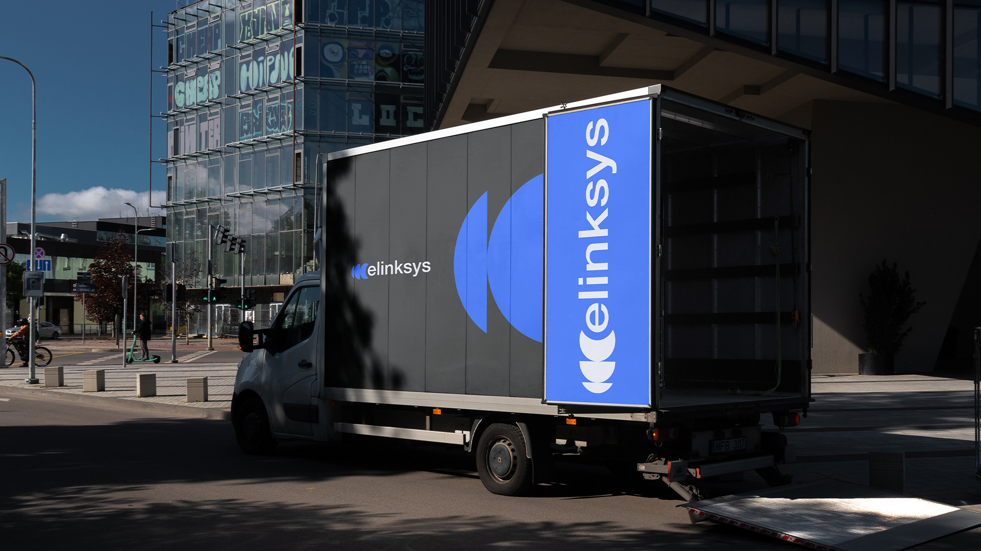
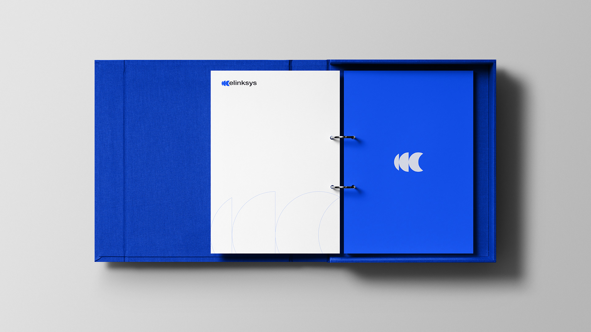
O símbolo da Elinksys representa a fluidez das conexões digitais, com formas dinâmicas que evocam movimento e integração — pilares fundamentais para a inovação no setor de tecnologia. A paleta de cores mistura o azul vibrante, que transmite energia e confiança, com o cinza, que reforça a seriedade e a solidez da marca. A tipografia moderna e o ícone modular reforçam a versatilidade da Elinksys, preparada para evoluir junto às novas demandas do mercado digital.
.
Elinksys — Smart connectivity solutions.
Elinksys was born with the purpose of creating digital solutions that drive the future.
The brand needed a visual identity that would convey agility, innovation, and technology — values that are part of its DNA.
The brand needed a visual identity that would convey agility, innovation, and technology — values that are part of its DNA.
The concept embraces the idea of movement, connection, and digital flow.
The vibrant blue combined with a solid gray tone builds a trustworthy and evolving image, aligning Elinksys with its mission: to create and transform connections for a more dynamic and intelligent world.
The vibrant blue combined with a solid gray tone builds a trustworthy and evolving image, aligning Elinksys with its mission: to create and transform connections for a more dynamic and intelligent world.
The result is a modern, simple, and flexible brand that evolves with the market and the needs of its clients.
.
.